Blogging tips
Showing posts with label Projects. Show all posts

Master Bath Transformation - Before and After

It's been a long stretch since I stopped in here for an update, so I figured I'd bring you up to speed on our bathroom redo.  When we moved into our house, I had a long list of "I'd like to change that." Our master bathroom, however, fell more under the S.O.S. category.  Still, I think there's benefit to living with a space, no matter how discouraging, for a while to really get a sense of what works, what doesn't, and why.  About six months ago, we decided to lift the quarantine.
Before I jar you with the "before" images, let's cleanse the palate and see what I envisioned for the renovation.


Now, brace yourselves for the "before"
(image from the MLS listing when we bought the house)

I like to call it:  the Mid 70s Builder-grade special.  With a splash of hospital. 
Original mauve tile, with walls painted to match.  Original vanity, which was curiously squat - even for a short stack like me.  Needless to say, there wasn't anything worth salvaging.

I use the word "master" bath loosely because, although it is ensuite, it is tiny.  Yes, it would be lovely to have dual sinks, but we actually don't overlap too much in terms of use.  We also didn't have much option to expand the space without creating a weird jut into our bedroom, or taking up valuable closet space.  So, the footprint had to stay.
The good news was that having a small footprint meant I could go a little more luxe in terms of finishes.  More than anything, I wanted to brighten it up, and try to expand the space visually.
I believe we accomplished that.


The design plan was pretty straight forward - I wanted marble subway tile to the ceiling in the shower, then to wrap around the other walls at a half-wall height.  The floor tile needed to have a higher grout-to-tile ratio to prevent slipping, so I opted for a small marble herringbone mosaic.  I carried the same tile from the vanity area into the shower to continue the visual line - another trick to make the space seem larger.  We designed a small vertical panel of the mosaic in the facing wall, because, hey, I couldn't get enough of it.  We were able to keep the lines all nice and clean by tucking two shampoo niches into the back wall.   So again, not an inch larger, but it feels soooo much more open!

P.S. - Artwork by my daughter and I (yay for freebies!)


I went with brass fixtures to warm up the color scheme, but mixed in polished nickel for the towel bar and tp holder to keep it from feeling too Liberace.

The other major component to visually enlarging the space was to mirror that baby up!  It was tricky, but I had plate mirrors cut for the dimensions of a mirrored medicine cabinet.  It's a nice, layered finish, and bounces tons of light.

The vanity base ended up giving me a bad case of the willies.  I envisioned converting an antique cabinet into a vanity, and searched for something with the perfect dimensions (we had no wiggle room), that would still function like a true vanity - to no avail.  Having a custom vanity built was out of budget, so I had to go with a standard vanity base.  Little disclaimer:  Unless you can't tell the difference, I'm not a fan of using Big Box store items for renovations, and I really felt like I was selling out, design-wise to use one, but I held my nose and did it. By topping it with a custom volakas marble top, though, I think I'm at least somewhat redeemed. ;)  It also meant there was room to splurge on the radiant floor heat, which. is. a. game changer.  Toasty toes instead of frozen-stuck-to-the-marble feet is a huge luxury in my boat!


I think it's fair to say the space was completely transformed.  Before, it was painful to see.  Now, it's a  pleasure to use. 

Sources:
Marble Subway Tile  ~ Marble pencil trim  ~  Herringbone mosaic tile (similar to)  ~  Shower fixture  (similar to) ~  Basin fixture  (similar to) ~  Vanity base (similar to, but think ours was more, and is nicer)  ~  Vanity top  ~  Mirrored Medicine Cabinet 


Staging a blog comeback: The Ick Master Bathroom

So, new year, new me.  As 'muricans, we all love a good comeback, so I'm attempting to make this mine.  Attempt being the key word.  We've done a lot of renovating over the last year and a half, and I've been a total slacker about documenting it.  So, I hope to catch up somewhat with that, but really, I just want to get back to the reason I ever blogged to begin with.  To give voice to my inner monologue, the heavy emphasis being on interiors, and to plan and organize decorating projects.

Jumping right in...Our master* bath.  It's en suite to our room, but otherwise, there's nothing master about it.  It is wee.  Eight by five feet, to be exact.  Anyway, it's next on our project list.

Behold.
 It's charming in that hospital-grade kind of way, right?
Original vanity that is super low, even for a shortstack like me.
 New tile, but I just can't deal.

I feel like I just stood in front of you naked.

For the record, it came to us this way.  The tile in the shower, and the vanity are the original 1970s builder-grade selections.  The previous owners installed new floor tile, and put a fresh coat of the oh-so-flattering mauve (flat finish, btw) paint and called it a day.
In the time we've lived here, the lack of an exhaust fan caused the ceiling paint to chip, and the sheetrock to bubble/chip.  Most of the walls also have water lines from condensation.  We've since installed an exhaust fan, but the damage was done.
We've been focusing our time/money/effort on other rooms the whole family enjoys, and I've been putting off the decision-making, but now it's time to bite this bullet.  Truth is, though I may not have run out of designing steam, our checkbook might've, so my original plans to make this a tiny but luxe bath have scaled back.

And that's where I'm at:  redesigning.

As a visual, my first thoughts were to brighten it all up (obvs), add a lot of reflective and light surfaces to bounce light, and address the seriously-lacking storage situation.  Something marbly and mirror-y like these would make me happy.

BUT, after crunching some numbers, and really thinking about elements I love, I'm pulling more in a mixed materials/textures direction.

Still on the white marble train, but instead of a lot of white/light gray cabinets, walls, etc,  I'm planning to mix in some med-dark wood tones with brass to keep the color palette a little warm.  We live in a traditional Colonial, so keeping some wood tones suits the home, too.
Heading somewhere like

I would love to reclaim an old chest for a vanity, and have done some searching, but our very specific space requirements have made it tough to find the right piece.  I'll probably end up with a ready-made vanity (boo!), and will instead focus on the preeeeetty marble herringbone mosaic that'll cover the floor.

So , I have some design-boarding to do, but at least I can think New Year, New Bath!

While the Girls are Away: Bedroom Redo

My "big girls" are spending a couple of weeks with their "Mims and Pops" in Texas, so I thought it would be a great time to surprise them with a room redo when they come home.   Currently, they have matching twin beds that are oriented in an L shape - not ideal or pretty.  They've been wanting bunk beds, and since it should help open up some floor space, we caved.
At the risk of going all-out girly girly, I'm planning on a (very light) lavender striped wall to coordinate with the Biscuit bedding that's on order.

Where I'm a bit stuck, though, is on rug selection.  My natural tendency is to over-match, so I often have to step back a bit to choose something that works, without looking too much like a furniture showroom.  I've put three variations into design boards to get a feel for what will look best.   I've ordered marquee letter lights in each girl's initial, but unlike the images, the letters will be gold.  

So, in general, a lot of softness going on.

My first choice is probably this loose floral rug that pulls in the lavender, but also gives me some wiggle room to accent with other colors.

Another option is this more "matchy" overdyed, low pile.

Then there's the wild card.  Offering a more high-contrast look, while still pulling in the base lavender.
Thoughts? Opinions?  Give 'em to me.

Powder Room Idea #1001

Just when I think my blogging days are over, the whim hits me to post, and I feel like I wanna share.  It praaaaably has something to do with the fact that I've been doing a cleanse this week, the last two days of which were a fast.  Brutal.  But today, I am fla fla flying with inner energy, so here ya go.

The last I stopped in here, we were in demo mode for our kitchen.  Happy to report kitchen is beautifully complete, but there's still things I wanna tweak before she's ready for her close-up.  So, patience, peeps.

We've been trying to tackle other rooms here and there.  I don't know if I've ever mentioned the scoop on the house we bought in our frantic quest for a home Stateside.  In a nutshell:  perfectly livable, but really generic.  Trying to add in character and style from scratch takes time.  And moolah.  Neither of which I have the buckets of I feel I deserve (please read: sarcasm).

For the last few months, I've been going back and forth over wallpaper choices for our tiny powder room.  It's the only bathroom on our main floor, and because of the micro nature of it, it needs a major injection of personality.

We replaced the old sink with a wider pedestal, and in the process discovered the lovely circa '74 floral wallpaper.

I've been all over the map with new paper ideas, but know I want a bold pattern, with a big repeat.  My first thought was to reach back to our Brazilian roots with tropicali afternoon - purchasable via Spoonflower.
I love this pattern, but here's my hang-ups:  Unless you specifically do a rush order, Spoonflower's shipping time is ridiculous.  Secondly, they price and parcel in single rolls.  It makes it more expensive, and more tedious to hang.

So, I never ordered it, and one day stumbled upon Enchanment from Thibaut.  A gorgeous Chinoiserie, in a bold color way, and a big repeat.  Perfect.  Ordered.
The only thing left to source is a mirror.  Because of the sconce placement, I need a tall, narrow mirror, but want it to have some shape.  I've been toying with something with beveled edges to bounce the light around (there's no natural light), but spied this black lacquer framed one, and think it might just work.  The dimensions are perfect, but is the outline too strong.  Hashtag: overthinking it.

Oh yeah, we're Keeetchin' ReeenOvaTORS

Well, I have a lot of catching up to do.  With Insta giving the 1000-words-in-a-snap synopsis, it might be redundant to blog, but I'm feeling optimistic.

When we bought this house, we hoped to do quite a bit to bring it up to speed.  It was, for the most part, totally livable, just not the style we would choose.  For example, over the past few months, we've had the basement completely renovated from a dark, cold cave to a warm, usable space.  Hopefully, I'll get around to detailing that, but today is about the KEETCHIN.

To preface:  I have some guilt over redoing this kitchen.  The people we bought the house from apparently prepped the kitchen for selling purposes - painted, and put it new granite.  They put a fairly nice face on what was still a 1970s builder-grade kitchen.


Just a note of opinion, here, while I'm at it:  Why do people renovate only to sell their home?  Why not put in the nice features to enjoy them while you live there?  As a buyer, I'd rather you leave the old stuff, and knock a few grand off the asking price, so I can make my own selections when it comes time to remodel. Sans the guilt of feeling wasteful.
So, yes, I feel guilty busting out a kitchen someone else thought was the bee's knees. 

We've lived with it for about six months to really get a feel for what did and didn't work for us in the space.  It's a decent-sized kitchen, but didn't maximize the space. There's the working wall of all the appliances, which left little counter/prep space.  Then, there was the fridge and pantry - pushed into a small walkway outside the main part of the kitchen.
Strange.
The little side bar area (on right in pic) wasn't deep enough for any small appliances, nor were there any outlets.  Basically, nothing more than a catch-all for all for the papers, lunch boxes, etc that traffic through here.
I liked the idea of having an eat-in area, but a round table (staged for selling) ate up a ton of real estate. 
After visiting with our contractor about the feasibility of moving appliances around, I came up with a rudimentary sketch that included plans to replace the double ovens with a single range, move the fridge into the main kitchen area, and add additional counter space with the sink placement under the window.  
The area vacated by the fridge in the passage-way would become a coffee station, with storage underneath for heavy small appliances (cuisinarts, etc), and the pantry would rotate to be accessible from the main kitchen.
We needed the storage the side cabinet provided, but planned it to be more of a standing desk/computer situation.
It'll be a tight fit, but we plan to put in a petite banquette/table along the back wall.
...Cabinet company rendering

I've been inspired by the greige kitchen movement.  I want ours to be classic - with touches of brass, nickel, white and black.  
 Well, you know - in a non-Martha/realistic version.

My working design board...
Some decisions are still in flux, but we're going with a shaker-style cabinet in a warm, mid-tone greige.  I think the color is actually called mushroom.  Or is it stone?  Not sure. 

We're about nine days in, have endured demo, and living with the essentials in a mock-kitchen.  Amazing how complete you can feel with an espresso machine and a hot plate.

And.  There's progress to report. 
So it's a good day to blog.

The Mulligan: Skylar's Nursery Reveal

So, if you were sorta, kinda following me through the One Room Challenge link-up, you know I didn't quite make the deadline to showcase my One Room in all its glory.
In my case, it was my baby girl, Skylar's, nursery.
There was a snafu with the wallpaper hanger's schedule, and I was bummed I couldn't reveal with everyone else who participated, but I got over it quickly when...
It happened.
 Remember, her room is barely ten feet square - it's so tiny, it's really tough to photograph without distortion. 
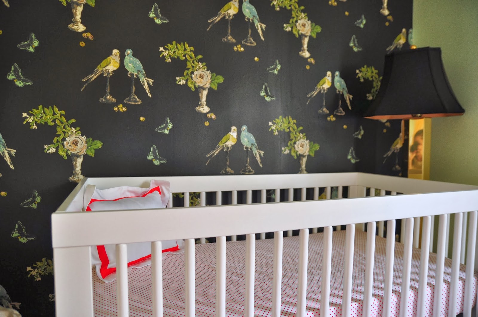
I decided on simple styling - you could easily go overboard with such a small space, and why would I try to compete with that wallpaper?   The other side of the room holds the closet, and her changing table, which I'm still in the process of refinishing (read: barely sanded).
 The crib linens are the Katie from the uber-talented, Bailey and her Biscuit Homegoods.
 The Fiery Red is perfection, isn't it?
 Is that a Skylar in there?!
 
We painted the walls BM Mint Julep, and the rug was an Overstock find - it's nice and cushy, but has a major shedding habit.  The crib is the Babyletto Hudson.       
The brass floor lamp is vintage, and may I mention my husband hates it, can't understand why I'd buy it.  As Skylar gets bigger, standing up in her crib, etc, I'm sure it'll find another home.
If Ben has his way, it'll be by the curb. ;)

I'm so in love with this little jewel box of a room.
I'm even more in love with its inhabitant.
I think it's safe to say we have one satisfied customer!
 
What do you think?  Was it worth the extra wait time?

Master Bedroom design - Help me decide!

 I won't have much progress to report tomorrow on Skylar's nursery, but I need your thoughts, impressions, etc on our master bedroom design.
Right now, we are minus a bed (boxspring/mattress on the floor is charming, btw), and I'm quickly tiring of looking for the most awesome bed.  We just need to get one bought.  Like. Now.
Not wanting to make a rash decision, I put together a few design schemes to help persuade my purchase....

I'm fairly set on deep navy walls, and we already own the bedside tables and lamps.  We need more clothing storage, a rug, and I'd like some mirrors to place behind the nightstands.

Here ya go...

Room 1:  Soothing palette using some lilac floral fabric I already purchased for some kind of canopy, pale gray bed, moroccan shag rug, and a midcentury-esque chest of drawers.


Room 2:  The wall mural from Anthro is a game-changer (thank you, Linda for the heads-up). In this scheme, paired with a navy velvet, clean wingback bed, french gilt mirrors, and a nubby jute rug.

 Room 3:  More or less the same scheme, warmed up with a chocolate velvet bed, layered kilim over the nubby jute, and a dash of black with the dresser.


So, which one?  Talk to me, Goose.

One Room Challenge: Week Three

Week Three. (ORC, hosted by Linda at Calling It Home)
More like Weak to See.
Not a ton of pretty progress to feast your eyes upon this week.
Sorry.
The rug did come in, and I'm fairly pleased with it. The colors are slightly different than they appeared in the product image - more purply-lilac than the pinky-lilac I was aiming for. Then again, it could be that the sweet, mauve color currently on the walls is giving the rug the heebs.
For a wool rug, in the odd size I needed, and the under $300 clams category, it'll work just fine. It also offers such a nice, plush contrast to my (ahem, haven't been vacuumed/mopped in over two weeks) hardwoods.
No judging.

 In other news....Our stuff arrived from Brazil - woo hoo!  We're still up to our ears in unpacked boxes.   Progress is sloooooow with three Little People in the mix.
BUT
My old changing table made it through Giese customs.  Sweet. 
 I have big, shiny plans for her - hope you'll approve.
And, that's about it.  I really, rully gotta get the walls painted.  I don't mind painting, and the three itty walls should be easy to knock out, it's just a matter of getting the ball rolling.
Thus, the call of the ORC.


One Room Challenge: Week 2

Have I mentioned I'm a little indecisive these days? Welcome back to the One Room Challenge link partaaay: Week 2.
As of last week, I had jumped on this ORC bandwagon as a way to focus my energies on getting one room in our house more or less completed. We moved in from Brazil in August, and the "to do" list for our circa '70s builder-grade home is long and distinguished.
Giving myself a six-week time limit via the ORC may or may not put me on the road to madness. Either way, it should be fun for you to watch.

As promised, I put together a design board, with the key feature of the room being the c'est magnifique wallpaper from Anthro. The more I put the sample against the wall behind the white crib, the more I thought there wasn't enough contrast. A quick polling of family & friends furthered that notion.
So, I kept thinking what other papers I love that would be a better contrast.
Perroquet, duh.
I do love me a good parrot.

And so it shall be.
Since I'm using the black colorway, I'll pay extra attention to lighting choices in the room to keep it from being too gloomy. Maybe I can get the hubster to spring for some sconces.
So.
Paper ordered.
Rug ordered.
Hope I can get my paintin' pants on sometime soon!

Stateside, and a Project Update

What?  Where am I?  I think I'm having serious displacement issues.  We made the big move from Brazil about three weeks ago.  It was so bittersweet:  happy to be moving Stateside, and closer to family/friends, but very sad to leave the Country we've grown to love, and which has been the only home our kids have known.  Now that we're back in the US, we definitely have the reverse culture-shock thing going on, but have thankfully been distracted by good times catching up with peeps.
We took a two-week stopover in Texas before heading up to our new place in Virginia, and I had a chance to check in on some progress going on with an e-design client.  It's not often I get to see the fruits of my design ideas in person.  Considering the clients are still unpacking boxes from their recent move, I think we can agree they have been super-motivated in pulling this room together.

When they moved in, the entire house (trim included) was painted a nice, muddy peach color, so a fresh coat of glossy white paint was numero uno on the agenda.
The house has fantastic, classic bones, so the idea is to bring in a hint of modern lines with clean, neutral furniture.
I think we're accomplishing that nicely so far...
Remember, we were working off this design board.   

We subbed in a large traditional rug the clients already owned, and went with the neutral colorway of New Vase on the cane chairs.
Looking back towards the entrance.  I'm kinda bonkers over the door.

 Detail of the chest with the clients' own photography work.
Everything in our life is so crazy right now, the calm color palette going on here feels really good to my brain.
Speaking of OUR situation, I'm trying to wrap my head around the fact that I have a whole house of our own to decorate!  We're actually starting from the basement level (again, a new thing for me) and will work our way up.  There's demo work happening there as we speak, so I'll get my blogging act together soon to give ya'll the scoop scoop on those plans.
In the meantime, I'm scooting kiddos off to new schools, and snuggling on a baby who is growing way too fast for my own comfort.
Thank you to all of you who have left sweet comments of welcome on my 'gram feed - it feels good to be Home.