Blogging tips
Showing posts with label Kitchens. Show all posts

Oh yeah, we're Keeetchin' ReeenOvaTORS

Well, I have a lot of catching up to do.  With Insta giving the 1000-words-in-a-snap synopsis, it might be redundant to blog, but I'm feeling optimistic.

When we bought this house, we hoped to do quite a bit to bring it up to speed.  It was, for the most part, totally livable, just not the style we would choose.  For example, over the past few months, we've had the basement completely renovated from a dark, cold cave to a warm, usable space.  Hopefully, I'll get around to detailing that, but today is about the KEETCHIN.

To preface:  I have some guilt over redoing this kitchen.  The people we bought the house from apparently prepped the kitchen for selling purposes - painted, and put it new granite.  They put a fairly nice face on what was still a 1970s builder-grade kitchen.


Just a note of opinion, here, while I'm at it:  Why do people renovate only to sell their home?  Why not put in the nice features to enjoy them while you live there?  As a buyer, I'd rather you leave the old stuff, and knock a few grand off the asking price, so I can make my own selections when it comes time to remodel. Sans the guilt of feeling wasteful.
So, yes, I feel guilty busting out a kitchen someone else thought was the bee's knees. 

We've lived with it for about six months to really get a feel for what did and didn't work for us in the space.  It's a decent-sized kitchen, but didn't maximize the space. There's the working wall of all the appliances, which left little counter/prep space.  Then, there was the fridge and pantry - pushed into a small walkway outside the main part of the kitchen.
Strange.
The little side bar area (on right in pic) wasn't deep enough for any small appliances, nor were there any outlets.  Basically, nothing more than a catch-all for all for the papers, lunch boxes, etc that traffic through here.
I liked the idea of having an eat-in area, but a round table (staged for selling) ate up a ton of real estate. 
After visiting with our contractor about the feasibility of moving appliances around, I came up with a rudimentary sketch that included plans to replace the double ovens with a single range, move the fridge into the main kitchen area, and add additional counter space with the sink placement under the window.  
The area vacated by the fridge in the passage-way would become a coffee station, with storage underneath for heavy small appliances (cuisinarts, etc), and the pantry would rotate to be accessible from the main kitchen.
We needed the storage the side cabinet provided, but planned it to be more of a standing desk/computer situation.
It'll be a tight fit, but we plan to put in a petite banquette/table along the back wall.
...Cabinet company rendering

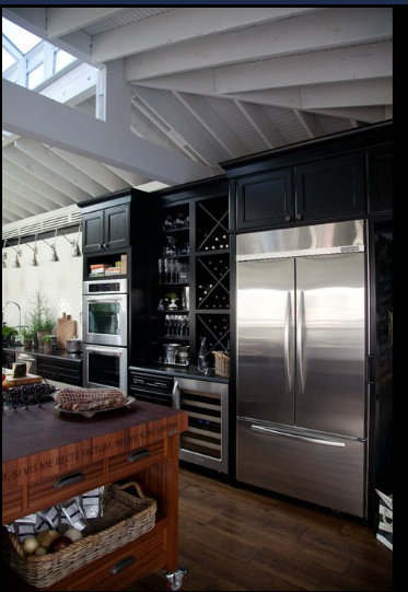
I've been inspired by the greige kitchen movement.  I want ours to be classic - with touches of brass, nickel, white and black.  
 Well, you know - in a non-Martha/realistic version.

My working design board...
Some decisions are still in flux, but we're going with a shaker-style cabinet in a warm, mid-tone greige.  I think the color is actually called mushroom.  Or is it stone?  Not sure. 

We're about nine days in, have endured demo, and living with the essentials in a mock-kitchen.  Amazing how complete you can feel with an espresso machine and a hot plate.

And.  There's progress to report. 
So it's a good day to blog.

First thoughts on Tyler's Kitchen of the Year for HB?

I don't know about you, but I would certainly, most definitely want a cook to design my dream kitchen. If it happened to be one of my Chef crushes, as is the case with Tyler Florence, then it would be the proverbial icing on the cake.
Just caught these first glimpses of the Kitchen of the Year he designed with House Beautiful, and so far, so goooood!
I can totally feel the unpretentious-yet-serious foodie-ness that Florence captures with his recipes.
I'm pullin' up a chair!

Needin' a Hookup + Dreamy Kitchens


I think this kitchen might be the perfect bridge between white and too white.

Fullscreen capture 4172011 84335 PM.bmp

I NEED to see it in its entirety, but I'm SOL trying to find this special edition down here (no digital version from what I can gather). Any Canadian friends wanna hook me up with a scan?

*Update* - Raina to the rescue! The kitchen is in fact a Lonny kitchen, but I guess H&H is doing an editorial of the same space.

While I await the goodness of the glossy gods, let's recap a few H&H kitchen oldies but goodies. Note: Ginormous. I realize the size may be skewed, but that's still a really large working (stove/fridge/sink) triangle to muster. Also, is that a brass pot filler amid all that stainless? If so, touch of warm metal = goodness.

Showroom kitchen via H&H

Bold yet beautiful. Obviously not worried about resale potential.
red kitchen canadian house and home

Fancy pants. It's alright, though. If you wanna go JLo in your kitchen design, I'm good with that. Just have me over for one of the espresso's that baby back there can whip up.

H&H poiters kitchen

Minimalist Art Collector knows what he's doing. Hope he doesn't mind splatters.

H&H Kitchen 1

Velvet in the kitchen. Possibly the most impractical application you could imagine for the fabric. Does that make this kitchen smug?

H&H eclectic kitchen

Contrast painting of mullions is delightful. Marble subways, no complaints. Stainless countertops = noise and a lot of dull knives.

H&H black cabinet kitchen

All-time favorite.

BobbieBurgersKitchen via H&H
Also, I'm thinking of starting a food blog. Would you follow? Need a clever name, though...

Dallas Client's Jump Start to Transformation

First off, thank you to everyone who sent me sincere feedback in terms of what you like about MLHP.
My takeaway was:
1) You're cool with design boards, so long as they are part of a story (i.e. my casa, client's home, etc)
2) If I'm going to slap up an image from a glossy that everyone and there sister is blogging about, then you'd like me to break it down, and talk about how to achieve a similar look. Great - I'd love to do this!
3) You love the He Said, She Said series - Awesome! I'll try to do more!
4) ...and, of course, you all love a good B&A - instant gratification mongers! :)

On that note....
I've been working with an e-client, Linds, who lives in Dallas. She and her hubster just moved from a darling, first-home in Big City Central to The Burbs of Big D. They had hoped to stay in Dallas proper, but the space they craved for their growing family sent them to the sprawls of suburbia. They found a large, charming home, but Linds wasn't taken with some of the builder-grade design, and wanted to get a jump-start on turning it into a stylish place that implemented at least some custom aspects.
So far, my job has been very easy. Linds has a keen idea of what she wants, and has great taste. I've merely offered a bit of consultation, sourcing, and an objective voice when needed.

Long distance design services can be somewhat unfulfilling if the client doesn't send "after" pics - you just have to assume they implemented your suggestions. But, nothing's more fun than getting the updates on spaces, so I was stoked to get some "in progress" pics in my inbox this weekend.

Linds' living room has double-height windows. This is the MLS listing pic of the room.
Encinias living windows before

I suggested making an investment in double-high, double-width curtains. Something to immediately add impact - like this:
HB double height curtains
house beautiful

Having curtains custom made can get dumb-expensive, but luckily, Linds already has a wonderful seamstress who put together her custom baby bedding. Even better is the seamstress doesn't charge a limb, and said she could handle the curtains - sans problème.

Linds wants to go with a blue/rich yellow/cream color palette to coordinate with her existing furniture, and I thought this fabric was pretty great with its slightly Indian pattern. It was on sale for $5.99 a yard, and we cleared them out!

Here's how they turned out (pardon the glare). Aren't they incredible? Me and amazing curtains - we be good friends!
IMG_20110225_182017

Linds is making more drastic changes in the kitchen. She didn't dig the faux-Tuscan cabinetry, but struggled over the decision to paint them the white she so badly wants. I think she probably received a lot of unsolicited advice about how she just, "can't paint those wood cabinets!"
My opinion is this: Wood is nice, but wood is not sacred. If it's a white kitchen you want to live with, then by all means, paint the damn things and LOVE it!
Fullscreen capture 2282011 84503 PM.bmp

...So, she did.
IMG_20110218_095020

Bought new hardware and lantern pendants, too. Good girl.
IMG_20110224_181034

Encinias kitchen new hardware
We still have some details to decide on, but this is shaping up very nicely!

This Helps...

Internet and time issues have sabotaged my efforts to post over the last two days, but getting my (as always, belated) but nevertheless happy issue of Coastal Living with this feature shoo'd away my sads...
This kitchen, and Tom Scheerer's work in general, make my heart go ga-thunk, ga thunk...and, you know, he's not too rough to look at, either.
Happy Weekend, stalkers! Come back Monday for THE Giveaway!

To hold you over...

Artsy-Fartsy collector's kitchen. Don't knock it - In my dream world, all kitchens like this come with someone who will dust all that out-of-reach jazz.
artsy fartsy kitchen via designtrackmind

Got a Design Dilemma Update that's been in the works for the better part of a year. You're gonna die for it - I did. Tune in mais tarde.

We're SO there!

Technically, Autumn began with the equinox last week - by the way, did ya'll see the Harvest Moon? However, for me, The Season truly begins today: the first of October. It's always such a great moment: the anticipatory prelude, the cusp, waiting for the great things to come: Pumpkins, Leaves, Football Rivalries, Charlie Brown, and lots of Comfort Food. Can you feel it?

Kitchen Disguised As...

Over the last couple of decades, we've seen kitchens become the clear winner of the Best All-Around Room award. Home construction and remodelings have functioned on the basis of knowledge that families desire, nay, require the kitchen to be large, open, and often a part of the grander family spaces.

More recently, key design elements of the kitchen have also adopted a less traditional stance. For example, we've seen the move to more open shelves and free-standing storage in lieu of blocks of installed cabinetry. Fixtures and hardware have become seminal design decisions too, as they play key roles in providing beautiful form, not merely function to a great kitchen. (A mere five years ago, I discussed the placement of recessed lights during our kitchen redo, but never gave a moment's thought to amazing pendant lights!)

There's more, though...smaller touches being used to blur the lines between kitchen and "other room?" I'm seeing fine rugs, mirrors, art and graceful chandeliers. It makes me think that perhaps homeowners want their kitchens to feel like so many other rooms they either don't have, or wish they could spend more time in.

The rugs and window treatments in this eat-in kitchen make it feel more like a family room.

Rolling ladder, vintage brass fixture over the island, and a perfect little reading spot? Clearly a nod to the library.

The combination of the metal bistro chairs, open shelves lined with simple glass jars, and classic barn lights makes me think this person would like to spend more time in their potting shed.

I love this kitchen. I'd venture to guess they either own a bistro, or would like to. Look at the classic elements: bar-like brass railing, a cozy banquette with a giant mirror overhanging. Not to mention that great collection of whiteware displayed. Chances are, they've also been to Paris!

Pendant lights over islands have taken on a design life of their own, but these polished nickel beauties make such an elegant statement. You'd usually see something like this relegated to a formal dining room, but why? If the average family's lifestyle resonates, then this pair of pretties will provide much more visual enjoyment in a more-used place.

These three kitchens are great examples of bringing mirrors and art into the kitchen. I rarely cast doubt on the use of mirrors anywhere, and having one reflect an already-enjoyable space is simply spectacular!

The much-blogged about kitchen by Richard Norris and Mark Leslie, that incorporated an antique French mirror above the stove. The designers had the specific intent of making the kitchen look more like a formal dining room.

They continued the vision with a grid of artwork around the sink area - a clever replacement for a window, I feel.Another take on a large scale mirror in the kitchen

And a more intimate mirror/art combo

If you feel your kitchen is less-than-ideal, consider bringing in items not traditionally placed in a cooking space. Surrounding yourself with items you treasure should be a house-wide endeavor. Happy Rearranging!!
Photos: Barbara Westbrook, Katie Ridder, source unknown, source unknown, Tim Clarke, Norris & Leslie, HB

Prettiest Kitchen

image via Antique Shops & Designers magazine
This kitchen, owned by Houstonite and Fabulous Flea designer, Mary Daly, is one of the prettiest I've seen in a long while. I love her casual, open shelving filled with the mix of high-end, silver pieces, and everyday (Target-available) elements like the glass cookie jars. I've got jars exactly like that, but I don't have one fab, vintage-looking juicer. Been eyeing them for years, and think it might have to be on my holiday wishlist. ;)
After seeing this pic, I tried to re-create her little coffee station. Doesn't it look so lovely? Needless to say, I think mine's missing that certain je ne sais quoi...
Maybe it's the ugly granite/dirt tile combo (hey, I didn't pick it out, it's part of the rent-free package). Mary's limestone subways and white woodwork lend themselves better to showcasing silver. So, I have something to aspire to!

Je t'aime: La chaise café français

A design element that for years has stopped me in my tracks is the classic, French cafe chair. I don't think I've ever met one that didn't win my heart. Perhaps it's the connotation of the chair's origin - Paris. Street side cafés drinking wonderful coffee or wine. People watching.
There's a lot to be said for bringing home an item that conveys such leisurely pursuits...

Which is why, I'm forever tearing-out, and digitally saving just about any picture of a kitchen who's owners obviously share my sense of romanticism.
This Victoria Hagan kitchen would do wonders for my soul each and every morning.
There's such an interesting mix in this London loft's kitchen (ahhh...that commercial cabinet!), you almost miss the chairs.
A beachy abode with a french twist - cafe chairs and cabana-striped rug - works for me!
This eat-in kitchen represents the best for me - casual dinners with family and friends, lingering over that long table.
Drew did it right, too - open shelves full of whiteware, retro fridge, and yes, the chairs. Can you believe this is her production company's kitchen?
Katie Lee Joel's tête à tête version. Oh, and the steel-frame windows don't hurt, either.
The chairs, in red - à la Provence.
If space is limited, there's always the bar stool version
Perhaps there's just some looks meant to produce daydreams...{le sigh}

Photo credits: AT, Things That Inspire, Telegraph-UK, Material Girls, HGTV, Domino, Domino, Visual Vamp, HB, HB